Massachusetts Department of Public Health seal Massachusetts Environmental Public Health Tracking

Tutorials - Mapping:Advanced Settings

Overview:

  • You can use layers and base maps to the add more features to your map
    • Layers- hazardous waste sites, environmental justice, schools, hospitals, etc.
    • Base Maps- streets and satellite images
  • Follow the steps outlined in the panels below:
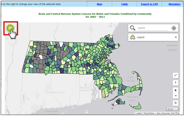
  • 1. Extra Features: (Layers and Base Maps)

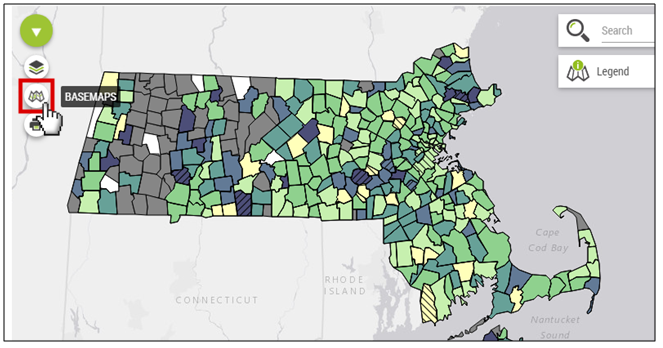
    Click on the green circle icon on the top left of the map.
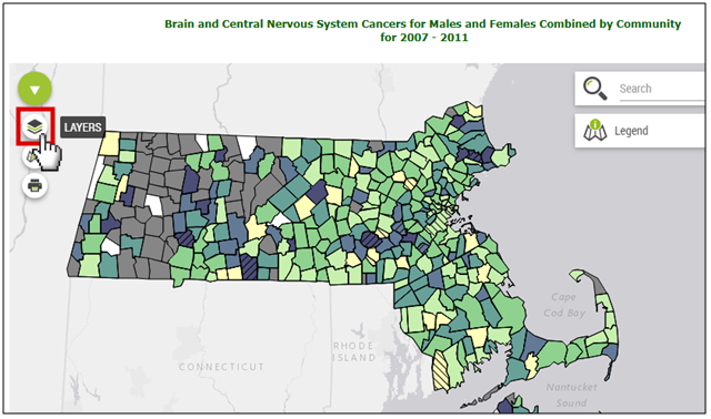
    There is a screenshot of the map result for a query. There is a red box around the green circle menu icon, which has three horizontal white lines in the center of it. The menu icon is on the upper left of the map window, and has a pointed hand cursor clicking on it.

    2. Layers:

    Click on the layers icon. If you hover your cursor over it, the word LAYERS will appear.
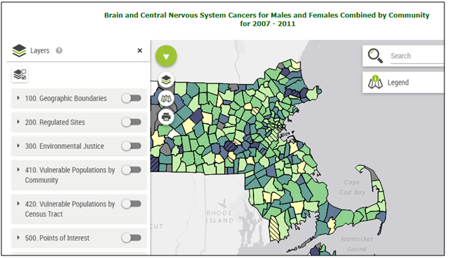
    The screenshot has a red box around the layers icon, which looks like squares stacked over one another. The layers icon is the first option below the green circle menu icon, and has a pointed hand cursor clicking on it. The word LAYERS in all capital letters is next to the icon.

    3. Layers:

    This setting has many different features to add to the map, including: geographic boundaries, regulated sites, environmental justice populations, other vulnerable populations, points of interest, and more.
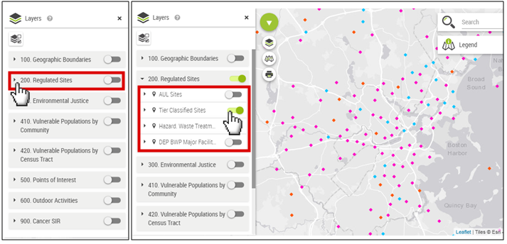
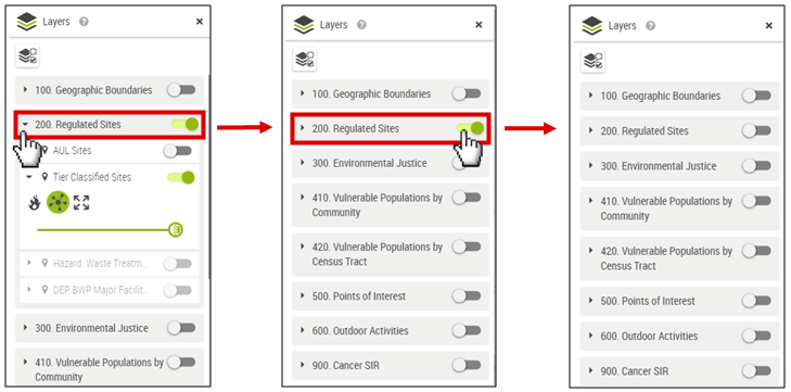
    The screenshot has the layers category list open. Their toggles are all grayed-out.

    4. Layers:

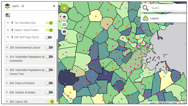
    There are two screenshots. The first screenshot has a pointed hand icon clicking on the Regulated Sites category, which is surrounded by a red box. The second screenshot has a red box around the Regulated Sites subcategories, which include: AUL sites, Tier Classified Sites, Hazard Waste Treatment Sites, and DEP BWP Major Facilities. The pointed hand cursor icon is clicking on the subcategory Tier Classified Sites, so that its toggle is green. The map displays these sites as point locations with pink, blue, and red diamonds. These colors correspond to Tier I, Tier II, and Tier 1D.
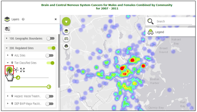
    5. Layers:

    Select the Heatmap icon so that it turns green to see the dot density visualization (red is higher, blue is lower). The top slide bar adjusts the coverage scale.
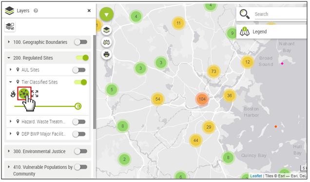
    There is a screenshot of the Tier Classified Sites fully opened tab, which contains a few gray selection icons, a red box around a green fire icon, and lines with green circles over them.  A pointed hand cursor is clicking on the fire icon. The map displays a vibrant heat map with red, orange, yellow, green, blue, and purple colors representing data.

    6. Layers:

    Select the Cluster icon to see numeric values summarizing the dot density of the feature.
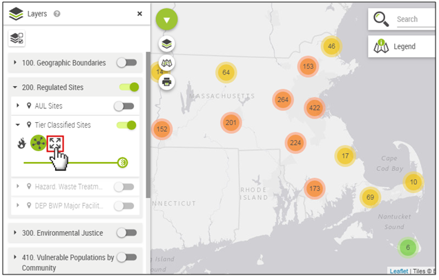
    The screenshot has a red box around a green circle icon with 5 black circles inside of it, representing many points connecting onto one point. A pointed hand cursor is clicking on it. The map summarizes the individual points into green, yellow, and orange circles with numbers inside of them to represent the number of sites in a given region of the map.

    7. Layers:

    Select the Zoom on Layer icon to see the data points for the whole state. Or click on a point and zoom in for detail.

    The screenshot has a red box around an icon with four black arrows. A pointed hand cursor is clicking on it. The map displays the green, yellow, and orange circles zoomed out, so that the whole state of Massachusetts is visible.

    8. Remove a Layer:

    Click on the tab to close it and click on the green toggle, so that it slides and turns gray.

    There are three screenshots, with red arrows pointing to the right in between them to indicate the progression of steps. The first screenshot has the Regulated Sites category surrounded by a red box with a cursor clicking on it. This category is selected, showing a list of subcategories and other features. The second screenshot has the same red box around the Regulated Sites category with subcategories closed and no longer visible. The pointed hand cursor is clicking on the green toggle to the right of the category label. The third screenshot shows the Regulated Sites category was turned off as the toggle is grayed-out.

    9. Multiple Layers:

    You can click on more than one tab and/or feature to put multiple layers on the map. This map has cancer SIR, tier classified sites, and hazardous waste sites.
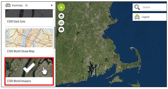
    The layer toggles are green for Tier Classified Sites, Hazardous Waste Treatment, and Cancer SIR. The map displays all layer representations at the same time. The towns are different colors representing SIR ranges, there are different colored diamonds representing different Tier sites, and there are circles with crosses and yellow corners representing hazardous waste treatment sites.

    10. Base Maps:

    When you hover your cursor over it, the word BASEMAPS will appear.

    The screenshot has a red box around the base maps icon, which looks like a folded paper map. The base map is the second option under the green circle menu icon, and has a pointed hand cursor clicking on it. The word BASEMAPS in all capital letters is next to the icon.

    11. Base Maps:

    Select a map type. There are a variety of street map options.
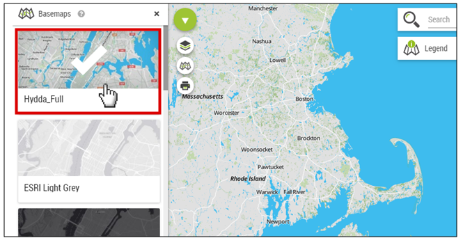
    The screenshot has 3 map selection options panels on the left-hand side of the page with a red box around Hydda_Full. A pointed hand cursor is clicking on it and there is a large white check mark on the selected panel. The map displays labeled streets in the map view window.

    12. Base Maps:

    There is also a satellite map option under ESRI World Imagery.

    The screenshot has 3 panels on the left-hand side of the page with a red box around ESRI World Imagery. A pointed hand cursor is clicking on it and there is a large white check mark on the selected panel. The map displays a satellite image in the map view window.
    This page was last edited on: