×

Massachusetts Department of Public Health seal Massachusetts Environmental Public Health Tracking

Tutorials - Mapping:Key Features

Overview:

  • After running a query for health outcomes or environmental exposures, most datasets will automatically create a map on a new browser tab.
    • Note that some databases won’t generate a map (e.g. drinking water)
  • Use the mapping tools to visualize your selected population(s).
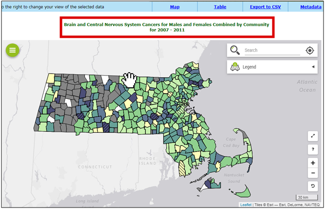
1. Title:

Double-check the map title on the top of the page to confirm that you selected the desired query information.
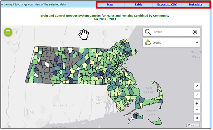
There is a screenshot of the map page with a red box around the title, Brain and Central Nervous System Cancers for Males and Females Combined by Community for 2007-2011 at the top. A map of Massachusetts has each town displaying data using different colors, representing a fixed legend for cancer standardized incidence ratio.

2. Tabs:

Use the tabs at the top to navigate between Map, Table, Export to CSV, and Metadata.
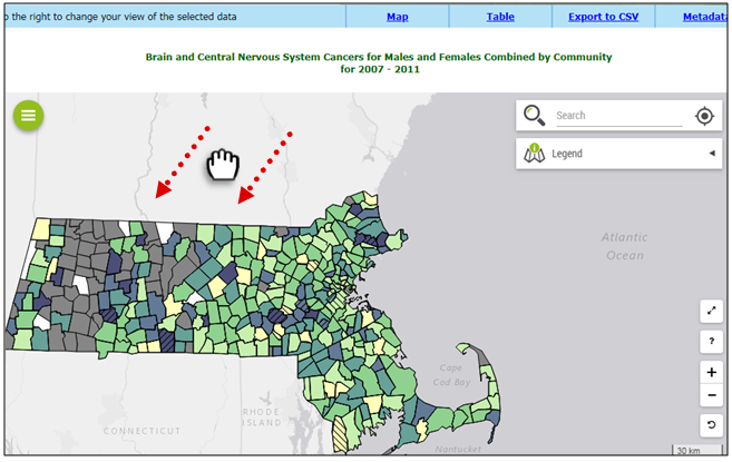
The screenshot has a red box around the tabs on the top of the page.

3. Moving the Map

Click on the map window and hold, so that the cursor is a closed fist. Drag where you want to move the map. You can also use the arrows on your keyboard.
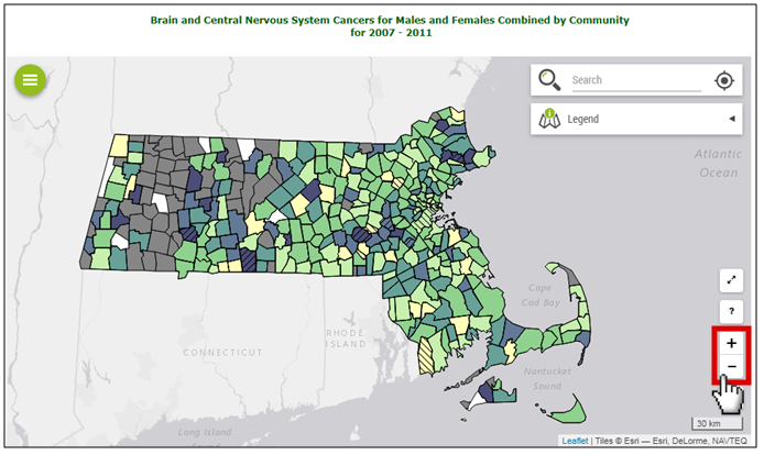
The screenshot has a fist cursor pulling the page downward with two red dashed arrows indicating movement.

4. Zoom In or Out:

To zoom in, click the + or use your mouse wheel to scroll up. To zoom out, click the - or use your mouse wheel to scroll down.
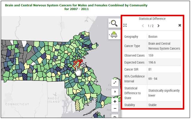
The screenshot has a red box over the plus and minus buttons in the bottom right corner of the map window.

5. Statistics:

Click on a town/region to get its statistics on the right side of the page. Use the x at the top right of the pop-out box to close.
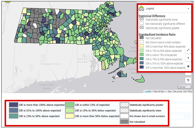
The screenshot has a pointed hand cursor clicking on the community of Boston, which is outlined in red. There is a red box surrounding the resulting statistical information, in a pop-up window that opens on the right and lists various values including Geography: Boston, Cancer Type: Brain and Central Nervous System Cancers, Observed Cases: 159, Expected Cases: 196.6.

6. Legend:

Click on the “Legend” tab or scroll to the bottom of the page.The static legend is only available for cancer SIRs.
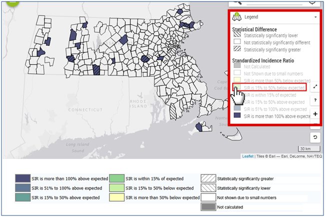
    Colors represent the standardized incidence ratio (SIR).
    Cross hatching shows statistical significance compared to the state.

The screenshot has a red box around the Legend window, which opens to the right of the map. It shows labels for each color on the map. There is also a legend in a red box on the bottom of the screen. The legend categories include: Not Calculated, Not Shown due to small numbers, SIR is more than 50% below expected, SIR is 15% to 50% below expected, SIR is within 15% of expected, SIR is 15% to 50% above expected, SIR is 51% to 100% above expected, SIR is more than 100% above expected.

7. Legend

Click on any legend category to remove its data from the map. Click on it again to put it back on. In this example, only SIR more than 100% above expected is remaining.
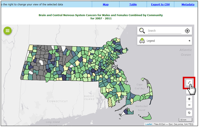
The screenshot has a red box around the Legend window. All of the legend color categories have dulled colors except one option, SIR is more than 100% above expected. There is a red box around the SIR is 15% to 50% below expected” category and a pointed hand cursor clicking it as an example. The map only has a few towns in purple, which corresponds to the SIR is more than 100% above expected category.

8. Full Screen

Click on the double arrows button to enlarge the map in a new browser window.
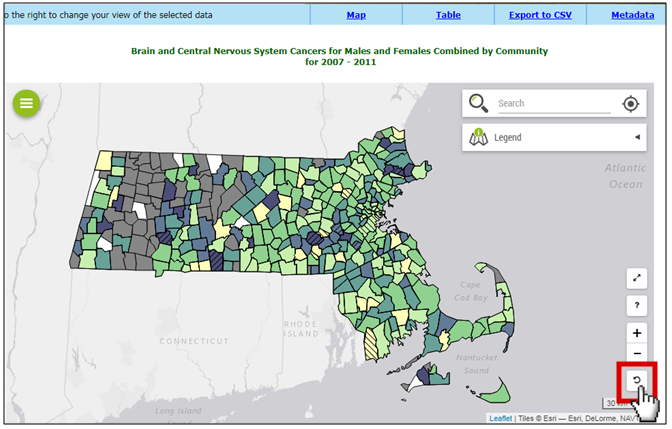
The screenshot has a red box around a button that looks like two arrows pointing away from each other at an angle. The arrows button is on the right side of the map window, and has a cursor clicking on it.

9. Undo

Click the undo button to remove previous zoom level.
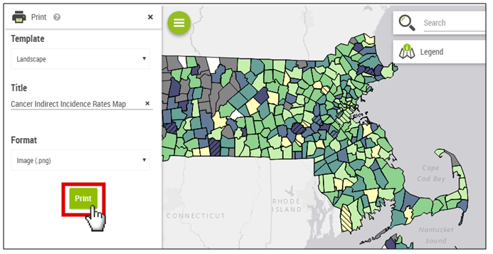
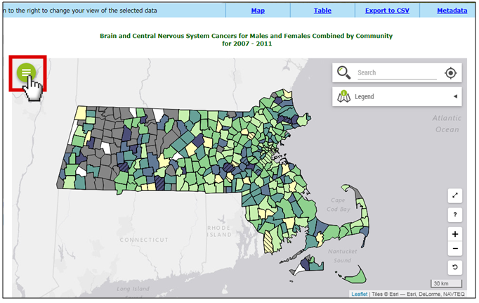
The screenshot has a red box around an undo button, which looks like an arrow pointing in a circular, counter clockwise direction. It is on the bottom right corner of the map window, and has a cursor clicking on.

10. Print Map

Click on the green circle icon on the top left of the map.
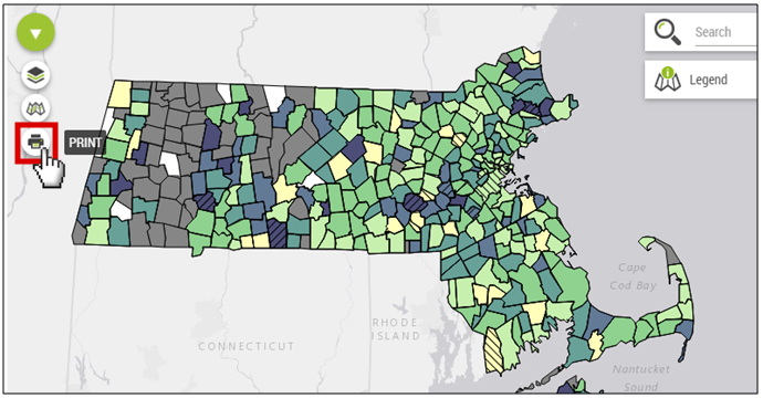
The screenshot has a red box around a green circle menu icon, which has three horizontal white lines in the center of it. The menu icon is on the upper left of the map window, and has a pointed hand cursor clicking on it.

11. Print Map

Click on the Print icon to print your map. When you hover your cursor over this icon, the word PRINT will appear.

The screenshot has a red box around the PRINT icon, which looks like a printer. It is on the left side of the map window, and has a pointed hand cursor clicking on it.

12. Print Map

Change the settings as necessary and click Print. The screenshot shows the print menu and has a red box around the green PRINT button with a cursor over it.

This page was last edited on: